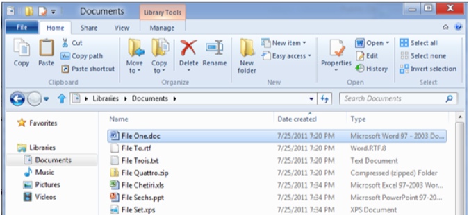
Microsoft is busy working on Windows 8, the next version of its operating system and, from what I’ve seen, I think that most people are going to like it. But one feature that’s a bit controversial is a new ribbon on Windows Explorer – the program used to manage files.
The ribbon is a band of icons near the top of the screen that can be used to issue commands like those used to copy, delete, move or rename files. Reasons for the ribbon, according to Steven Sinofsky, president of Microsoft’s Windows division, include that it “provides the ability to put the most important commands in very prominent, front and center locations” and “makes it easy to find commands predictably and reliably.”
Microsoft’s decision, according to CNET News, “has triggered some complaints,” but Sinofsky said in a follow up blog post that “We chose the ribbon mechanism, and to those that find that a flawed choice, there isn’t much we can do other than disagree.”
I haven’t had a chance to put Windows 8 through rigorous tests so it’s premature for me to comment on whether or not I’m going to like this change but I can say that I’m less than enthusiastic about Microsoft’s decision to use a ribbon on Microsoft Word, Excel and other office applications as a replacement to its traditional menus.
Call me old-fashioned but I like the old menu interface that’s used on most Windows and Macintosh programs. It’s consistent across programs and it’s pretty easy to find whatever command you wish to implement by exploring various options under menu items like File, Edit, Tools, etc.
Having to issue a command by hunting around various ribbons or icons often takes me longer than selecting a menu items but the worst part is that there are commands that I simply can’t find without having to resort to the help system or – worse – having to go online to try to find out how to get something done.
Maybe I’m old-fashioned because I’ve been using these menu interfaces since the mid-eighties when Apple launched the Mac and Microsoft rolled out early versions of Windows. But I think it’s more than just familiarity that causes me to prefer menus. It’s consistency.
Ironically, Apple – which has revolutionized the interface on the iPad and iPhone – does is more of a stickler for applications using menus than in Microsoft. There are lots of Windows programs that have no menus – just icons or ribbons, but virtually every Mac program I’ve used does have a menu system.
Ironically, it’s experienced users like me who are most likely to have a problem with this change. Novice users will adapt to whatever they learn on. But the reality is that there are very few novice computer users these days – most people in the western world now have some experience with PCs and Macs.
I have nothing against adding new ways of doing things but it seems to me that Microsoft ought to allow the user the choice of doing things in a familiar way even as it adds choices and new interfaces.
Be the first to comment