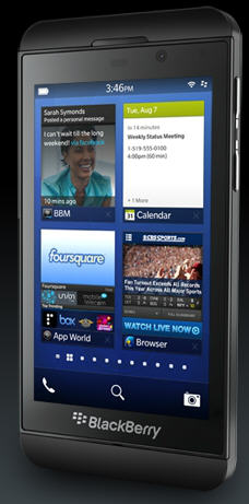
For the past several days I’ve been using the Blackberry Z10. That’s the one with the touchscreen, not to be confused with the Q10 that has a physical keyboard.
My impressions were positive once I got used to the interface, which is quite different from Android and iPhone. Still, I’m not convinced that the phone will be able to overcome the significant headwinds created by its late arrival and the growth of the iPhone and Android ecosystems.
The first thing you notice about the phone is that it looks a bit like the iPhone 5 (though slightly taller, wider and heavier with a slightly larger 4.2 inch display), but any similarities to the iPhone start to vanish the moment you turn it on. In some ways that’s good. The new BlackBerry 10 operating system has a lot of unique characteristics including a very different way of getting around and launching apps.
If you’re migrating from an iPhone or Android, you may be a bit lost at first. I was until I viewed the animated tutorial (you can access it from the Setup menu and a web page at any time).
Home(button)less
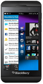
There is neither a physical nor virtual home button Navigating is all about gestures. For example, swiping up and right gets to you to the BlackBerry Hub where you can view your email, text messages, calls and messages from Twitter, Facebook, Linked In and BlackBerry Messenger (BBM). The multitasking operating system and gestures make it pretty easy to switch from app to app without having to return to a home screen, which is a good thing because there really isn’t a home screen though there is a screen that displays all your installed apps that you get to by swiping up and to the left.
About the only similarities to the iPhone and Android are that you can launch an app by touching its icon and can zoom out and in by pinching and spreading your fingers. You can minimize an open app by swiping up from the bottom or close it by clicking an x. A menu icon (3 dots in the lower right corner) gives you access to options on some apps
If you’re migrating from an iPhone or Android, you may be a bit lost at first. I was until I viewed the animated tutorial (you can access it from the Setup menu and a web page at any time) because there was neither a virtual or physical home button.

Home(button)less
There is neither a physical nor virtual home button Navigating is all about gestures. For example, swiping up and right gets to you the BlackBerry Hub where you can view your email, text messages, calls and messages from Twitter, Facebook, Linked In and BlackBerry Messenger (BBM). The multitasking operating system and gestures make it pretty easy to switch from app to app without having to return to a home screen, which is a good thing because there really isn’t a home screen though there is a screen that displays all your installed apps.
Swiping up and to the left brings you to all your apps. About the only similarities to the iPhone and Android are that you can launch an app by touching its icon and can zoom out and in by pinching and spreading your fingers. You can minimize an open app by swiping up from the bottom or close it by clicking an x. A menu icon (3 dots in the lower right corner) gives you access to options on some apps.
Easy to use but no-so easy to learn
The nice thing about gestures is that they are available almost regardless of what mode you’re in so, it could be argued that it makes the phone easier to use. But it’s not easier to learn. Aside from the fact that it’s different from Android and iPhone, it’s also not as intuitive. I wasn’t at all productive with the phone until I had a chance to review a tutorial.
Another out-of -box annoyance, at least for new BlackBerry users, is that you have to set up a BlackBerry account but an Android is pretty useless without a Google account and iPhone users pretty much need to set up Apple accounts so I’d call it that part a draw. Speaking of out-0f-box, it was beautifully packaged almost as if they had hired Apple’s packaging team.
Excellent touchscreen keyboard
The touchscreen keyboard is quite nice and it does a great job suggesting not only the correct spelling of the word you’re typing but the next logical word. For example, when I set out to type “This is a test of the keyboard” I typed “Th” and “this popped up.” After I selected This it automatically suggested some next words including “is.” While easy to do, the process is not intuitive To select a word you have to flick it up with your finger, which I didn’t figure out on my own.
Apps
Blackberry claims that there will be 100,000 apps by the time the device hits the street, likely around March 28th. Certainly there are already apps for Facebook, Twitter and Foursquare along with a calendar, email, camera YouTube, New York Times and plenty of others but there is no Netflix or Instagram app so far and the roster of apps is a fraction of what you get with iPhone or Android. Clearly, if the platform is successful, app developers will jump on board but, if it’s not, you can expect relatively slow growth when it comes to additional apps.
Hardware:
Although .8 ounce heavier than an iPhone, at 4.78 ounces, the Z10 is certainly light enough and I like its rubberized back cover that makes it easier to grip and less likely to drop. Sizewise it’s 5.12 inches tall, 2.58 inches wide,0.35 in deep. The iPhone 5 measures 4.87 inches by 2.31 inches by .3 inch.
The 4.2 inch screen has 1280 by 768 resolution at 356 pixels per inch. By contrast, the iPhone 4-inch screen is 1136 by 640 at 326 ppi. The Z10 comes with a Dual core 1.5 Ghz processor, 2 GB of RAM and 16 GB flash storage. There a slot for a microSD card to provide up to 64 MB of additional storage.
As always pricing varies by carrier but AT&T has already announced $199 with a two year contract.
